Monday, April 20, 2015

Ian Shelton 04 - Compositional

So there were two different works that really caught my attention this time, and, as it turns out, for the same reason.  The first of which, the works of Annette Lemieux, appeals to me (less so then the second [upcoming]) due to the compositional way that the pieces interact with one another.

Annette Lemieux

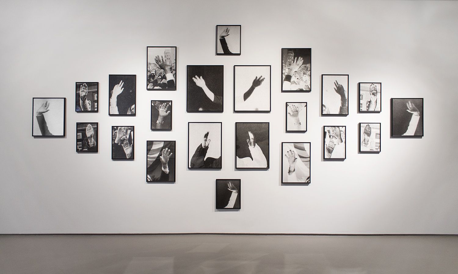
The creation of a new image built of these other images, similar to a photomosaic, creates a beautiful composition and, astonishingly, I actually like it.  I am somewhat disappointed that the images are all the same, except flipped and negatived, however, BUT this is not the case with the second works, which are those of Adam Magyar.  These images, though similar, are all different, and, when displayed in a gallery, make a non existent panorama of a single continuous image.  The images themselves are lovely, but it is truly the way that the pieces interact that makes this a beautiful work.  For my final piece, I am inspired to do something similar, and hopefully, with potent results

Installation shot, Light Work, Syracuse, 2013

Monday, April 13, 2015

Fusselman :: PHILIP - LORCA DICORCIA :: "East of Eden"

A display of the bizarre within completely normal-looking photographs. Technically, they don't appear upsetting. Their composition, color, and display is traditional and pleasant. It is the thematic content of the photographs that transforms them into upsetting or bizarre experiences.


Political and religious commentary + emotional noise comes out after a couple of reflective moments immersed in the work.


Once you become aware of a hidden element, you begin to look for it in every photo. It is not always clear, the message. It takes interpretation that is not always correct.


Taking bizarre elements and putting them into the real is a totally interesting endeavor to me. It is unnerving to encounter the ugly displayed as the norm. It is the right kind of upset. A disturbance to the familiar progression of daily life, or the expected effect of artwork.

BINH NGUYEN 04 // SHANE MCADAMS

S H A N E   M C A D A M S

After Shane McAdams' show, I was inspired to recreate his aesthetics using my own photographs. Although his pieces are very intriguing, I'm curious as to how this will have an affect in photographs. Will they take away or add more into a photograph? Although McAdams' work are based of landscapes, my interpretation will incorporate portraits instead.

With his use of ballpoint pens and resin, he was able to create these colored streaks. I'm not quite sure what the process was in order to create a broad range of colors, so I think it will require a lot of experimentations. In blackballed pens, the "black" ink is actually a composition of multiple colors so I think that's where the colors came from. 


Julia Cornelius 04

Julie Saul Gallery
Adam Magyar
Kontinuum


Train video can be found here:  http://www.magyaradam.com/


Tyler Boyle - Trip 4

In the Realm of Pyramids The Visual Philosophy of AGNES DENES


      Although the gallery itself was more focused on line drawings/technical drawing of structures I found this piece to be interesting. The process of thinking of an idea, then sketching it out, and following through is intriguing. I also think the grand scale of the project plays into its appeal.


Jitka Hanzlova

One to One


     The horse pictures were nothing to write home about, but the photos in the smaller back room were way more interesting. They were much more appealing and the use of color, light, line, pattern, and texture made these photos exceptional.

Emily Gilmore- Boomoon

Boomoon


Naksan #8263, 2010

Naksan


Flowers Gallery
529 West 20th Street, NYC


This guy is a social enigma. He creates large format photographs of landscapes that are typically devoid of all human or animal life. His series Naksan was shot during snow storms on the beaches of
Naksan, the eastern coast of the Korean peninsula. Each shot has a three-part composition of land, sea, and sky.

Boomoon has been working with this type of imagery since the 1980's. The prints signify a sense of self-reflection for him, and they offer a meditative visual space for viewers.


Naksan #934, 2014

"When I am in the field, the image itself decides what moment I am waiting for."


Installation view at Flowers Gallery, NYC

David Zwirner Gallery- Lucy Van Ellis

Although I wasn't able to attend the gallery tour to Chelsea last weekend, I looked through the itinerary and searched for what I felt was the most influential artist to me. I stumbled upon the artist Frank showed me when he came back from the tour and felt he was also my favorite artist.

Philip-Lorca diCorcia's show East of Eden is overflowing with perfect lighting acts as a calm veil throughout his work. His prints are on the cooler side and consist of environmental portraits. The photographs feel candid, yet planned because of the perfect light and composition that goes into each of them. His work feels like a quality planned snapshot. His images take everyday activities and make them feel somewhat surreal.

diCorcia was born in 1951 and studied a both the School of the Museum of Fine Arts and Yale University. He is now a current New York resident and reaches at Yale University in New Haven, Connecticut.

My favorite work was of a young boy jumping on a bed in what looks to be a sun room. It's a very simple photograph but has just enough detail that it is curious enough to engage a viewer for awhile.  The placement of the baby doll, the white lines on the blinds and the trees lining the deck add an extra something to these images.


Tuesday, April 7, 2015

Delmes & Zander Gallery // Kelly Mullin


My favorite gallery was the Delmes & Zander Gallery. The gallery has them as a group show but my piece for inspiration is called "Type 42". I did some research to try and found out more and succeeded. Turns out the series was made around 1969-72 and they can't find out who the artist is. They decided that the date has to pre-date 
public's access to the earliest technologies in video recording. The series fully contains 950 Polaroid photographs and contains images of actress on television. Most contain some sort of information written on it such as their name, movie title, or date.


I'm gonna create Polaroid images of images that I shoot of Robert Downey Jr. to try and gain the same effect these do. I will use many of the movies he is in and photograph as I watch them I'll capture the images. It will be a fun final critique.


Toshio Shibata // Hannah Pigeon 03

Toshio Shibata studies the way that water exists in harmony with man-made structures and landscapes. His exhibit was at the Laurence Miller gallery. I appreciate his muted color palettes, and I love the pictures in which nature is more dominant than the man-made structures. I think his use of color and subject matter really highlights how the way that man-made structures can take something fluid and beautiful, and transform it into something rigid and ugly. I wanted to study the way that occurred in the city via spaces that I found to be particularly beautiful or ugly because of the way man interacts with nature.


I tried to get a range of detailed and landscape shots. For the ones that show an uglier side of the way that humans interact with nature, I wanted there to at least be some humor involved. This can be seen in my photo of Coors Lights cans in a patch of dirt. Some of them are very subtle interactions, such as a vine growing on the side of a house or the playground in the background of the spikes that had fallen off the tree. Shots in which there is great emphasis on the detail become more direct in the way they address the viewer. I tried to counter that by having my details be subtle. For example, the random medley of object I photographed was somebody's garden, but you might not be able to tell upon first glance. The rocks turned out to be a wall that someone built, and a groundhog inhabited. While the detailed shots were more compelling upon first glance, I much preferred the ones that lead the viewer through a space.


Monday, April 6, 2015

Andrew Jimenez // Shane McAdams 4

During our most recent trip to Chelsea, I was inspired by Shane McAdams and his pieces with Ball Point Pen on resin. Berk stated something about wanting to see one of his students trying to do this with photo, and I already had an idea on how to recreate it.


It immediately reminded me of the "Northern Lights", even though I interpreted the pieces as non-representational. With further research in to McAdam's work, I saw he uses the same effect paired with representation imagery, creating incredible landscapes and tunnel effects. He uses the colorful lines to act as water, and sky-scapes. 


McAdams studied art history in the Univ of Kansas and got his MFA at Pratt in NYC. Through his artist statement on the MOMA website I learned his inspiration comes form landscape, especially that of growing up in the west, which i did as well. The skies are different there, at sunset and dawn they appear painted, with much more vibrant and jovial colors compared to here on the East Coast. I want to work off his idea and bring those skies here to areas in the tri state. 

Monday, March 23, 2015

Fusselman - KEN SCHLES : Invisible City / Night Walk

Ken Schles, with images full of texture and honesty, was a real joy to experience. His photographs turn the snapshot into its ideal - stopping moments in time filled with real people - giving them meaning with nostalgia, joy, or sorrow.


Is this funny, or is it very very sad? Did he wake her, or did he take the shot and leave? The responsibilities of photographers capturing real life seem very great to me; a respect for the subject and a transfer of its honesty. Or maybe none of that - maybe sometimes simply being the hand that solidifies the moment, without any message or opinion.


These are my favorite photos - the ones that depict natural emotion and social interactions of daily life. His images are full of energy, humanity, and realism. They make me excited to live a life; they give meaning to photographing it. All we have are the spheres around us to pull from - all we can give is what we have seen. Ken Schles made a darkroom in his shitty New York apartment and got started seeing things.


And this girl. C'mon, Schles, you're killin' me.


Brit Warakomski - Andrew Borowiec's Provence


I really enjoyed Andrew Borowiec’s Provence exhibition at Sasha Wolf Gallery.  He perfectly captures the stillness and mood of solitude, just by taking photos of what is right in front of him. 

I had looked up some of his previous work, and found that a lot of it consists of daytime photographs documenting middle America. They are in stark contrast to the photographs in Provence.  I was especially impressed by the amount of sharp detail captured in the building’s texture, and each image uses a wide range of grays.


In response to his work, I attempted to photograph night scenes around rural sections of New Jersey.  It was a learning experience.  Stacking a pile of books as a replacement for a tripod will not give you the results you want, but I was working with what I had. 


Reuben Cox // Hannah Pigeon 02

"Topical Songs" is Reuben Cox's attempt to take photographic techniques and combine them with more organic forms. For example, this hornet's nest is covered in cyanotype to attain the right color, and explore with texture.
Domestecia 2


While all of the pieces generally dealt with themes involving nature, there was a lot of experimentation involving medium and color. For example, the following photo is an archival inkjet print composed of negative images in which the color has been altered.

Girl Problems
Cox also experimented with collaging, painting, and shadow boxes. Here, he uses gouache on top of an inkjet print. 

Rain on the Sun Roof (Santa Barbara Craft Fair)
While I think the show definitely had a great underlying theme of studying artificial versus organic, the variation in medium, color, and subject was distracting. That is why I decided to focus in on one aspect of his show. I took his experimentation with color and interest in using process that incorporates photography without actually being a photograph, and I made CMYK silk screen prints. My prints also focus on organic versus artificial, but I chose to focus in on very specific small details within an urban setting. It shows the way that nature can conquer any setting. CMYK printing done by hand allows for controlled, yet experimental color. The attention to small details allows my viewers to notice the colors more as well as construct their own narrative or theme based on the combination of images. The whole show was a bit of a sensory overload, but it had some great moments. I wanted to conduct my own study based on the good parts of it.


The Definition of Force
The Guy


Brit Warakomski - Response to Magnificent Obsessions


Matthew Sleeth is a visual artist and photographer from Melboune, Australia.  His exhibit at Claire Oliver Gallery entitled Magnificent Obsessions is comprised of  multiple series of photographs depicting objects that could be considered mundane or uninteresting to an average viewer. Sleeth positions the photographs in grid form, in an attempt to enforce the idea of collection, or repetition.

I can’t say that I either enjoyed his exhibit, or hated it…but I do enjoy collecting and sorting, I just never thought to put the idea into photographs.I think that most of Sleet's work seen that day would be better suited in an artist book, or some sort of publication, not necessarily a gallery setting.


New York Lights


Abandonded Umbrellas


In response, I searched for found light in and around my neighborhood.It wasn’t really on purpose, and I found it interesting to see what I became drawn to. Once I started taking  the photos, I found it enjoyable to search for a specific thing. Once I noticed something, there always seemed to be an abundance of it when I started looking for more.